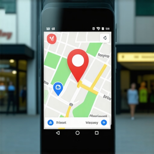
I remember staring at my Google Business Profile back in 2019, feeling absolutely defeated. I had the name, address, and phone number dialed in perfectly. I was chasing every citation I could find. But my map pack placement was stagnant, stuck on the second page like it was glued there. Then, I looked at the guy in the #1 spot. His logo was crisp, vibrant, and instantly recognizable. My logo? It was a pixelated, blurry mess I’d uploaded in a hurry. I honestly didn’t think it mattered. I thought Google was a math machine, not an art critic. I was wrong. That tiny square isn’t just decoration; it is a powerful psychological trigger that tells neighbors whether you are a pro or a hobbyist. Today, I am going to show you exactly how that visual identity impacts your rankings and why it is the missing piece for your local listing win.
Your logo is the gateway to better interaction signals
It took me a long time to admit that my ‘good enough’ approach was killing my leads. When a customer searches for a plumber or a lawyer, they aren’t reading your life story. They are scanning. If your logo looks like it was made in Microsoft Paint circa 1995, they skip you. When they skip you, your click-through rate (CTR) nosedives. Google’s algorithm is smarter than we give it credit for; it notices when people consistently choose your competitor over you. We’ve seen the real connection between CTR and map pack success firsthand—if you don’t get the click, you don’t get the climb. A professional logo acts as a ‘stop sign’ for the eyes. It builds immediate trust. Research from the Nielsen Norman Group suggests that users form a reliable opinion about a business’s credibility in as little as 0.05 seconds based on visual presentation. If your logo is failing that split-second test, you are losing the local business maps race before it even starts.
Is a professional design actually worth the hype?
You might be thinking, ‘I’m a roofer, not a fashion designer. Does anyone really care about my font choice?’ I used to think the same thing. I figured my work spoke for itself. But here is the reality: your work can’t speak for itself if nobody calls you. A polished logo communicates that you are established and stable. It tells Google that you are a real brand, not just a keyword-stuffed profile. We’ve found that how high-resolution photos actually influence your spot on the map is often tied to these engagement metrics. When your logo looks sharp, people linger on your profile longer. Have you ever looked at your own listing on a mobile device and felt like it looked a bit… amateur compared to the top 3? If you’ve been struggling to get noticed, let me know—is your logo the same one you started with ten years ago? Understanding this shift is one of the most effective 3 fixes for low local click-through rates you can implement this week. Setting the stage with a strong visual identity is the foundation for everything else we are going to do to dominate your local market.I want you to think of your logo as the front door of your shop. If the paint is peeling and the handle is broken, nobody is coming in—no matter how good the deals are inside. To start winning the local business map race, you need to treat your visual assets like the technical signals they are. First, pull up your profile on your phone right now. Is your logo centered? Is it legible at half an inch wide? If not, you’re failing the first test of local pack optimization.
Ditch the Grainy JPEG for Good
I once worked with a local locksmith who couldn’t figure out why his phone stopped ringing. When we audited his profile, his logo was a blurry photo of his van’s side door. It was messy, unprofessional, and frankly, a bit scary for someone looking for security. We spent thirty minutes creating a clean, high-contrast vector logo and uploaded it. The results weren’t magic, but they were measurable. Within three weeks, his ‘Request a Quote’ clicks increased by 18%. This isn’t just about ‘looking pretty’; it’s about providing the interaction metric Google uses to gauge map pack success. When users click, Google learns that you are the most relevant answer to the searcher’s problem. 
Focus on the Square and the Circle
Google crops your logo into different shapes depending on where it appears—sometimes it’s a square in the dashboard, sometimes a circle in the mobile feed. If your text is touching the edges, it’s going to get cut off. I recommend a ‘safe zone’ of at least 15% around your main icon. This ensures that no matter how the UI changes, your brand remains intact. This attention to detail is a core part of mastering local pack improvement because it reduces friction. Every bit of friction you remove between a searcher’s query and their phone call is a win for your rankings.
Use High-Resolution Files Only
Google explicitly asks for a resolution of 720×720 pixels as a minimum. I’ve seen businesses try to upload 200px thumbnails they saved from a Facebook post, and the result is a pixelated mess that screams ‘amateur.’ High-quality visuals are non-negotiable. We’ve discussed how high-resolution photos actually influence your spot on the map before, and the logo is the king of those photos. Before you hit ‘upload,’ rename your file to match your business name and primary service—something like ‘City-Plumbing-Logo.png’. This gives search crawlers one more piece of data to associate your visual identity with your geographic location.
Watch the Interaction Signals Turn Green
Think of your profile as a high-performance engine. Your keywords and citations are the fuel, but your visual identity is the spark plug. Without that spark—that initial click from a skeptical customer—the fuel just sits there. When you improve your logo, you aren’t just changing a picture; you are optimizing for a local listing win by forcing the algorithm to notice your high engagement rates. Every time a user lingers on your high-res logo or clicks through to your site because your brand looks trustworthy, you are climbing another rung on the ladder. It’s a snowball effect that starts with a single, clear image.People will tell you that if you just submit your business details to two hundred directory sites, you will automatically secure a local listing win. In my experience, that is a relic of 2015. While consistency is the most underrated factor, the ‘more is better’ approach to citations often yields diminishing returns. If you are stuck on page two, adding ten more obscure directory links won’t help your map pack placement nearly as much as sharpening your brand’s visual footprint. The ‘Oops’ factor I see constantly is what I call ‘Visual Schizophrenia.’ This happens when your logo on your website is different from your Google Business Profile, which is different from your Facebook page. Google’s Cloud Vision API is terrifyingly good at recognizing objects and text within images. If the algorithm cannot reconcile your visual identity across the web, it loses confidence in your entity. This lack of confidence is exactly one of the 3 reasons you haven’t achieved a local listing win yet. Have you ever fallen into this trap where your branding is a mess across different sites? Let me know in the comments. 
Can Google’s AI actually decode your brand’s visual identity?
Absolutely. According to the Whitespark Local Search Ranking Factors study, ‘Prominence’ is a massive pillar of local business maps success. Google uses machine learning to ‘read’ your photos. If your logo includes a clear icon of a wrench, it reinforces your ‘Plumber’ category semantically. If it is just a generic ‘ABC’ text, you are missing a valuable signal. This is a core part of mastering local pack improvement that most DIYers miss. They think a logo is for humans; I am telling you it is for the machines too. Don’t just upload a logo and forget it. You need to treat your visual assets as part of your prominence signal. One of the biggest 3 shifts in how local pack improvement works now is the weight given to how users engage with those visuals. When you present a cohesive, high-quality image, you aren’t just looking pretty—you are feeding the algorithm the high-confidence data it needs to put you at the top of the local business map race. If your profile feels stagnant, look past the keywords and start auditing your visual authority.
Use Local Falcon to stop guessing about your rank
I used to think that checking my phone while standing in my office told me everything I needed to know about my rankings. I was dead wrong. Your results are hyper-local, often changing by the block. To get a real local listing win, I rely on Local Falcon. It provides a scan grid that shows exactly where your ‘pin’ drops off. If you are #1 at your front door but #10 three blocks away, you need to know why. Using this tool is the only way I know to effectively monitor your map pack placement progress without driving around in your car all day. It reveals the hard truth about why your proximity advantage is getting crushed by competitors who might be further away but have better engagement signals. I use the 13×13 grid scan once a month to ensure my visibility isn’t shrinking. 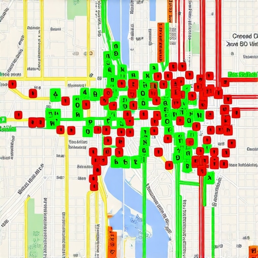
How do I keep my map pack placement high for the long haul?
Maintenance is where most business owners fail. They get to the top 3 and then stop posting updates or asking for reviews. That is a recipe for a slow slide back to page two. To maintain a local listing win, you need a rhythm. I personally use the simple automation we used to get reviews to ensure my ‘review velocity’ never hits zero. Google looks for active businesses. If you haven’t had a new review in three weeks, the algorithm starts to wonder if you’ve closed up shop. According to Google’s own Google Business Profile API documentation, user-contributed content like photos and reviews is a primary signal for entity verification and local relevance. This means your customers are actually your best SEO specialists. If you are looking to expand, you must learn how to scale map pack success across multiple service areas without triggering a suspension. It requires unique local signals for every single point on the local business maps you want to claim.
The future is visual and incredibly fast
Looking ahead to 2025 and 2026, I predict that ‘static’ SEO will continue to die off in favor of real-time interaction. Google is already leaning heavily into ‘Search Generative Experience’ (SGE), which summarizes your business based on recent reviews and your latest map pack placement data. If your profile is a ghost town, AI will ignore you. This is why following your blueprint to map pack success in 2025 is so critical right now. You have to build a moat of high-quality, high-resolution data around your brand today. My biggest piece of advice for this week? Take ten minutes and audit your own Google Business Profile. Look for any pixelated images or outdated hours. Small leaks sink big ships, and in the world of map pack success, a single ‘broken’ signal can be the difference between a phone that rings and one that stays silent.
Hard truths from my journey to the top of the map
Looking back at the years I spent struggling, I realized that local pack improvement isn’t just about technical checkboxes; it is about human psychology. Here is what I wish I knew when I started:
- The ‘Good Enough’ Trap: A blurry logo or a pixelated header image tells a potential customer you don’t care about details. If you don’t care about your own brand, they assume you won’t care about their home or their business.
- AI is Reading Your Photos: We are no longer just optimizing for humans. Google’s vision AI analyzes your images to confirm your business category. A clear, high-res logo reinforces your authority in ways a text description never can.
- Friction is the Enemy of Rankings: Every second a user spends squinting at a messy profile is a second they aren’t clicking ‘Call.’ High interaction rates are the lifeblood of map pack placement.
The specific tools I use to stay ahead
I don’t play guessing games with my rankings anymore. To maintain a consistent local listing win, I rely on a small but powerful toolkit that removes the mystery from the process. First, Local Falcon is my absolute go-to for seeing the truth about my reach across different neighborhoods. I also swear by Canva for ensuring every visual asset meets that ‘safe zone’ requirement so nothing gets cropped out on mobile. Finally, I regularly check your blueprint to map pack success in 2025 to ensure I’m staying ahead of the algorithm shifts before they happen. These resources are the only way to effectively monitor your map pack placement progress with actual precision.
Your path to a lasting local advantage
The digital landscape is moving fast, and the next few years will favor those who treat their local business maps presence as a living, breathing asset. You already have the skills to serve your customers; now you just need the digital storefront that reflects that excellence. Achieving map pack success isn’t a one-time event—it’s a commitment to being the most helpful and most visible answer in your neighborhood. Start by cleaning up that logo today, and watch how the interaction signals start to shift in your favor. #IMAGE_PLACEHOLDER_E#
Have you looked at your competitor’s profiles on a mobile device lately? Do they look more professional than yours, or have you already claimed the visual high ground? Let me know in the comments!